top of page

WOKINABOX REBRAND
Wokinabox was experiencing a significant downturn in their sales and as part of reviewing the business model, a brand refresh was proposed.
Through customer surveys it was clear that consumers felt that the produce wasn't fresh and that the brand overall felt stale. The brand refresh needed to appeal to a younger and more family oriented audience, be much brighter and communicate "freshness".
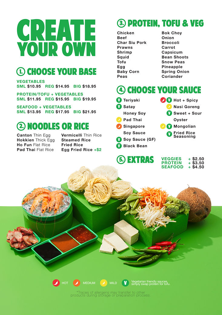
This involved creating a logo, colour palette, photography style, packaging, overarching brand guidelines, producing a photoshoot, as well as a complete roll out of creative assets to launch the refresh across all touch points; in-store visual merchandising, website build, social assets and 3rd party aggregators like UberEats.
LOGO DESIGN


COLOUR REFINEMENT - LOGO

COLOUR REFINEMENT - PRODUCT CATEGORY PALETTE

MENU PHOTOGRAPHY STYLE INSPIRATION


MENU PHOTOGRAPHY STYLE FINAL
bottom of page


-1_edited.jpg)
_Page_4_edited.jpg)
_Page_3_edited.jpg)
_Page_6_edited.jpg)
_Page_2_edited.jpg)
_Page_5_edited.jpg)


